
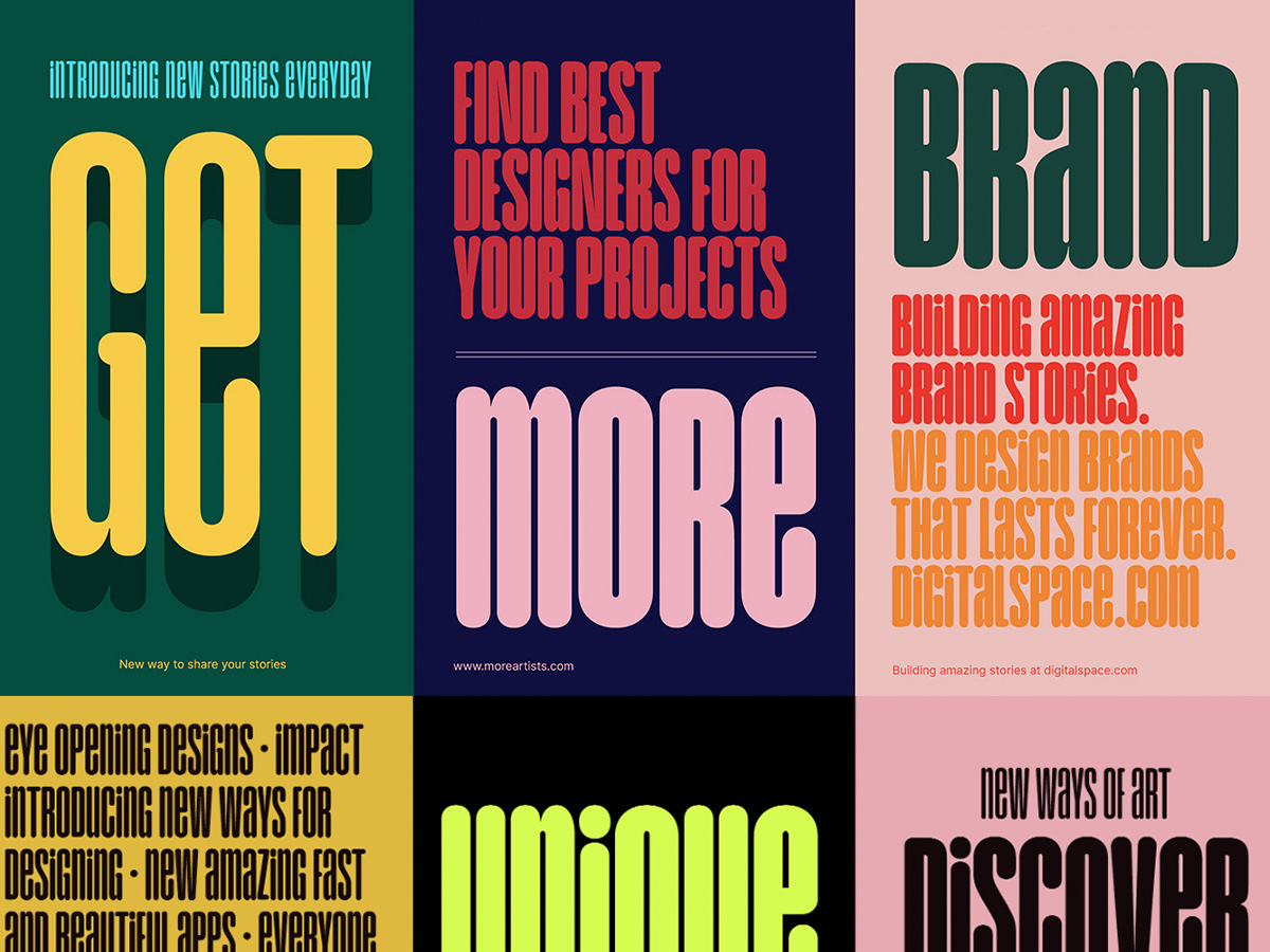
Typography isn’t just decoration - it’s the language that carries emotion and meaning in design. Fonts aren’t just a designer’s concern; they’re a tool anyone can use to communicate more effectively.
Here are 5 things you need to know to master typography, even if you’re not a designer:
1. Why Typography Matters
Fonts have the power to change how people perceive your design. The right font makes you look professional and trustworthy, while the wrong one can undermine your entire message.
2. Font Categories: Serif, Sans-Serif, Script, Mono
Understanding the basic font types makes choosing much easier:
- Serif: Has decorative strokes (serifs), feels traditional and formal (e.g. Times New Roman).
- Sans-Serif: No strokes, modern and minimal (e.g. Arial, Helvetica).
- Script: Resembles handwriting, creates a soft, creative feel (e.g. Pacifico).
- Mono: All characters have equal width, works well for code or a retro aesthetic (e.g. Courier New).
3. Pairing Fonts Like a Designer
Font pairing isn’t as complicated as it sounds. The simple rule:
- Primary font: Choose something readable that carries the main content.
- Secondary font: Choose something that creates visual emphasis and draws the eye. Try pairs like Roboto & Playfair Display for a perfect balance.
4. Typography and Branding
Your font is your brand’s “voice.”
- Young, energetic brand? Try modern fonts like Montserrat.
- Classic, formal brand? Times New Roman is a safe choice. Pick the right font and your customers will feel your message much more clearly.
5. Practical Font Tips
Avoid these common mistakes:
- Using too many fonts, which creates visual noise.
- Fonts that are too small or hard to read. Stick to 2-3 fonts in a design and make sure your letter spacing is reasonable - your work will look noticeably more professional right away.
Keep following along for more posts where I help you build your personal brand with marketing and design knowledge from Nate!