
Color is one of the key elements in design, helping evoke emotions, set the mood, and attract the viewer’s eye. However, choosing colors that are both harmonious and appealing can be a real challenge - especially if you’re not a professional designer. In this article, I’ll introduce you to the 60-30-10 rule, a simple formula that makes choosing colors for your design much easier.
https://www.natecue.com/wp-content/uploads/2024/11/20241026-194054.mp4
What is the 60-30-10 Rule
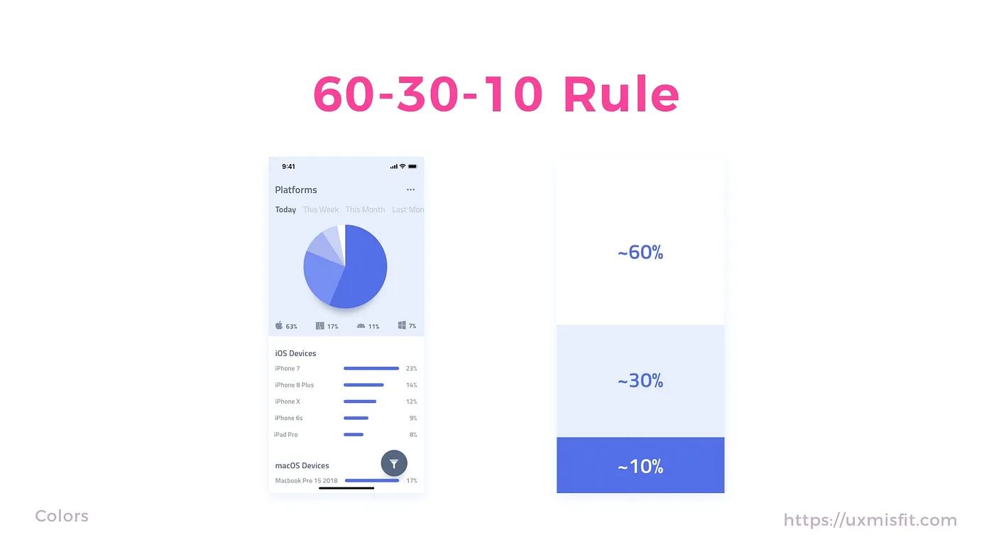
The 60-30-10 rule is a classic three-color combination method used by interior designers, fashion designers, film directors, and graphic designers to create harmonious and balanced color palettes. The principle specifies that an ideal color palette should be divided in these proportions:
- 60% dominant color
- 30% secondary color
- 10% accent color
The dominant color is the focal point of the design - it stands out and makes a strong impression. The secondary color plays a supporting role, acting as a backdrop for the dominant color and adding visual depth. The accent color, with its bold contrast, brings excitement and brightness to the overall design.
Strengths of the 60-30-10 Rule
- Emphasizes key elements: The large proportion of the dominant color draws attention to the main blocks and sets the overall mood of the design; the secondary color helps balance things out so it doesn’t feel too harsh, while the accent color at 10% does the job of highlighting specific features or sections of the design.
- Visual balance: To achieve visual balance in a design, no single color or element should overpower the others; the 60-30-10 rule ensures the design feels balanced by allocating a percentage to each color. Note that these ratios aren’t set in stone - the numbers are more of a relative guideline.
- Simplicity and consistency: Combining three colors simplifies the design process while preventing the use of too many colors; it limits color clutter and creates consistency throughout the design.
How to Choose Colors Using the 60-30-10 Rule
Step 1: Choose the Main Color (Dominant Color)
When choosing your dominant color, consider these factors:
- Brand colors: pick a dominant color that feels most fitting for you - it could be your favorite color, or one that represents the personality you want to convey; if you’re writing or designing for a brand, you’ll need to stick closely to the branding guideline.
- Target audience: choose a color based on your target audience and the emotions you want to evoke. For example, if you’re designing a health app, you might use soft, calming colors like blue and green.
- Design goal: think about the purpose of the interface design and the message you need to convey. For example, if you’re designing a travel app, you might choose vibrant, bold colors like orange and yellow.
Once you’ve chosen your dominant color, make sure it appears in the most prominent areas of the design - such as the background, heading, or main button.
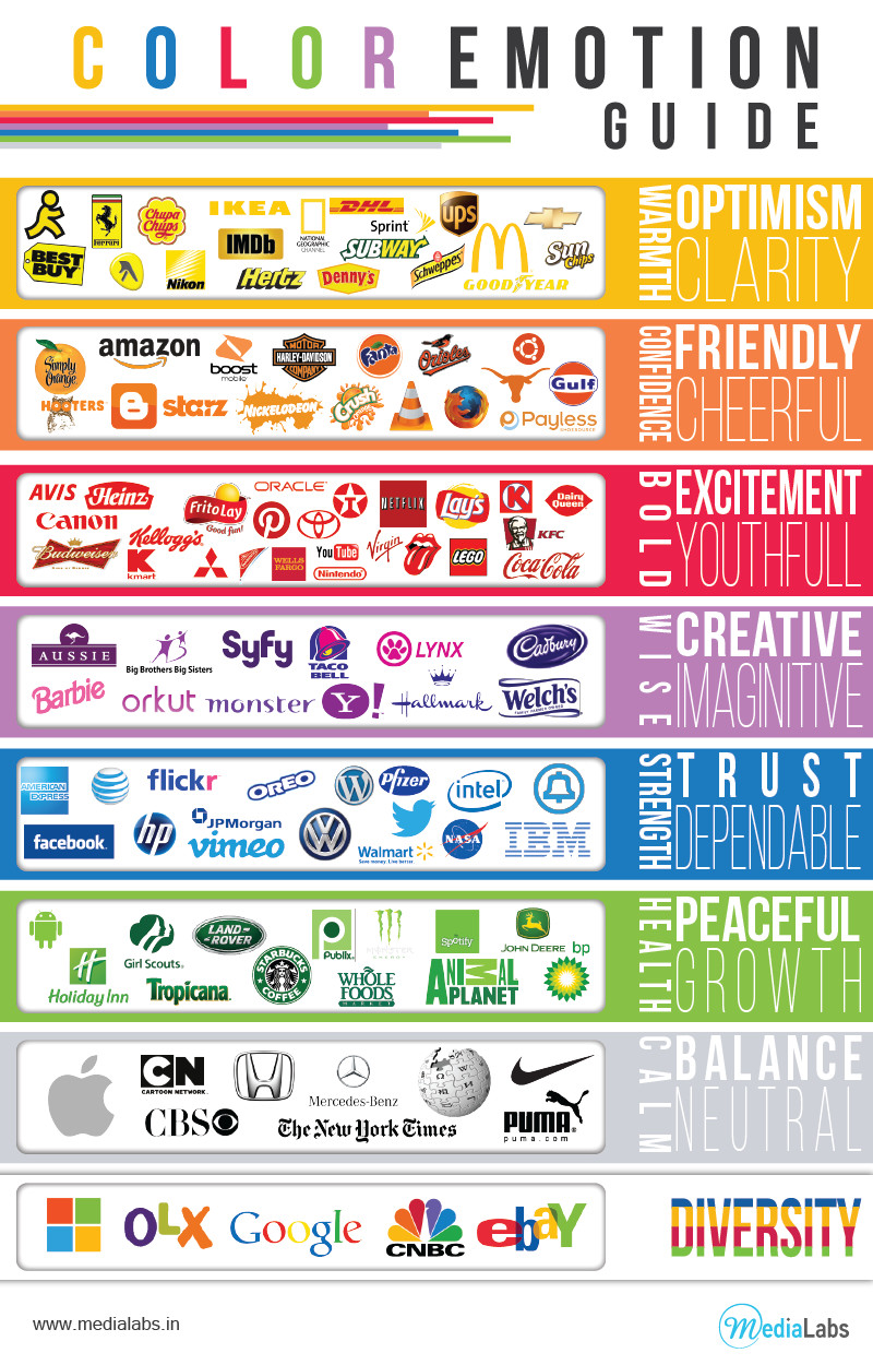
Step 2: Choose the Secondary Color
This color supports the dominant color and adds more visual interest to the design. It takes up about 30% of the design. The secondary color can be used for typography, icons, and sub-headings or captions in a design. Colors like black, dark blue, and others can work well as secondary colors.
The secondary color adds visual appeal and supports the main color, typically taking up around 30%; here are some ways to pick the right secondary color:
- Color theory: this is the most common approach - you use the Color Wheel (link) and select based on color schemes. This is the more formal method and requires a decent understanding of color pairing.
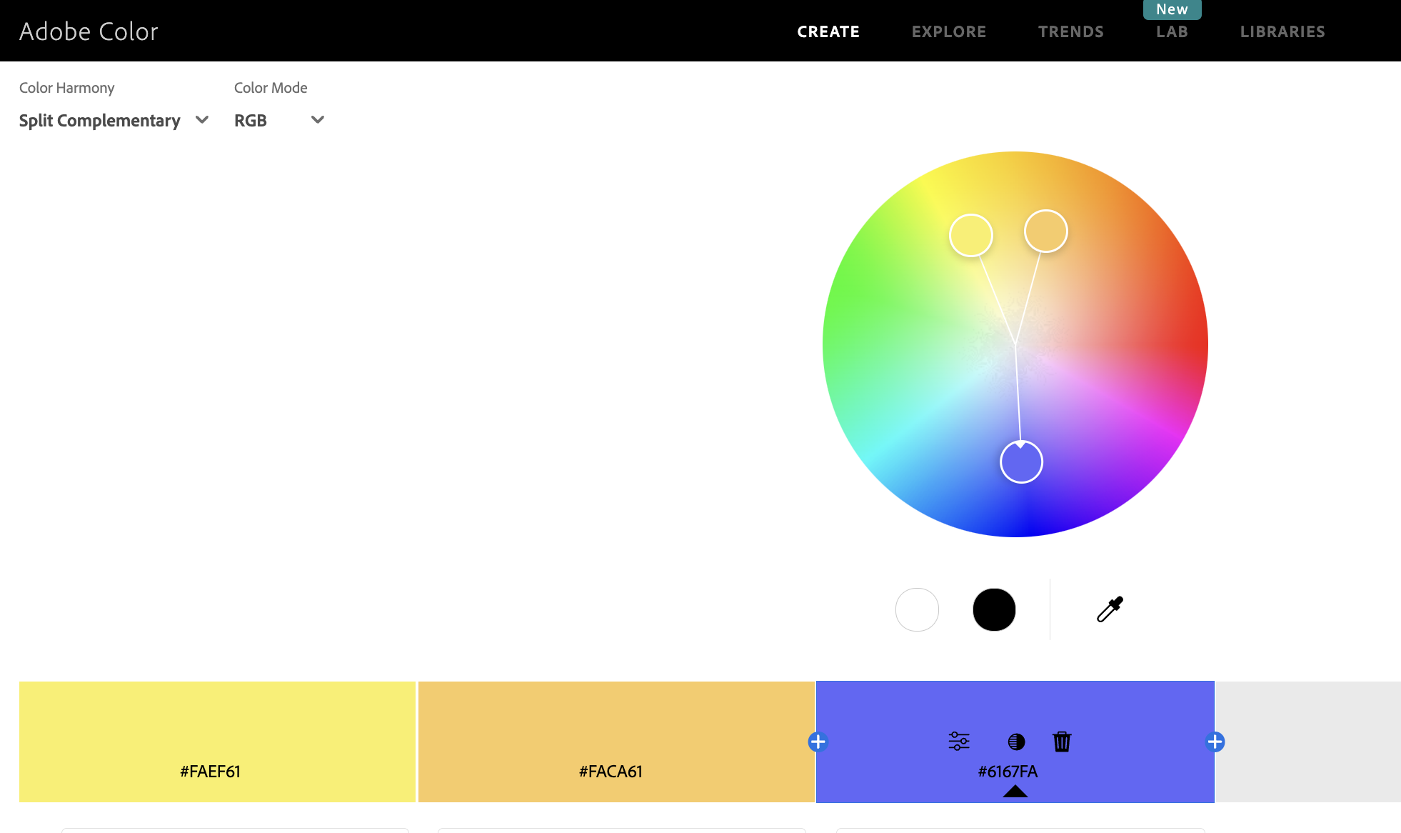
- Contrast: choose a color with high contrast relative to your main color. For example, if the main color is dark, pick a secondary color in a lighter tone, like in the image below.

- Mood: choose a color based on the emotion and vibe you’re going for. For example, if you’re designing for a fitness app, the colors you pick should feel fresh and energetic - like red or orange - rather than neutral tones.
Once you’ve chosen the secondary color, use it to highlight important elements in the design such as headings, subheadings, or call-to-action buttons.
Step 3: Choose the Accent Color
This color typically takes up about 10% of the design. Its main purpose is to add emphasis - it’s usually a color with high contrast or one that stands out clearly from the other two colors in your design. This color is optional depending on your taste.
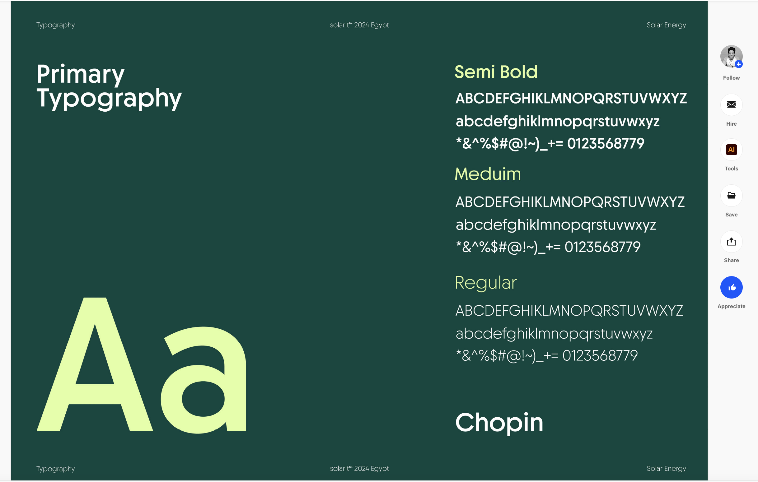
Below is a pretty clear illustration of how to apply the 60-30-10 rule when choosing colors in design - definitely worth a look.